
From DoorDash Data Scientist to Data Consultant: Daniel Parris’s Career Journey in Data
Intro
Daniel Parris is a data scientist and data journalist. He was one of DoorDash's first data science hires, working at the company for six years (as well as two extra years as a consultant). He now provides data science consulting services and writes Stat Significant, a weekly newsletter featuring data-centric essays about movies, music, TV, and more.
He's taken on some fun pop culture questions over the last few years, including:
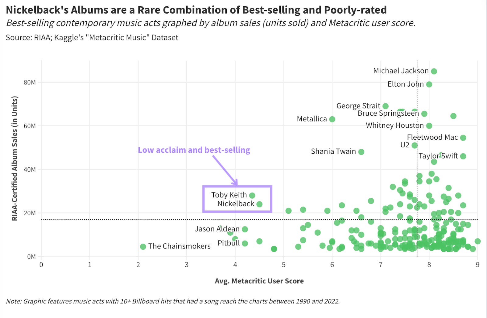
Why Do People Hate Nickelback So Much?
Who's the Greatest Actor in Movie History?
When Do We Stop Finding New Music?
Daniel initially majored in film and started his career in the entertainment industry before transitioning into data science. He combined his passion for pop culture and his data science skillset to create Stat Significant.
If you enjoy his writing, you can subscribe to his newsletter at the link below.
In this Q&A, Daniel shares his approach to data visualization and what he learned about data storytelling while working at DoorDash.
Why Did You Leave A Full-time Role at DoorDash to Start a Newsletter and Consulting Business?
I was at DoorDash full-time for nearly six years. When a startup is in a perpetual state of hyper-growth, like DoorDash was through 2021, it feels like time is better tracked in dog years. I saw the company go from ~150 employees to thousands of full-time hires—my tenure at the company felt like 40 years' worth of career experience. Once DoorDash went public, I felt like there was less for me to learn.
While at DoorDash, I worked on numerous sides of the business—sales ops, driver growth, consumer growth, e-commerce, etc.—and felt that my analytics skill set could adapt to various companies' needs. I had been a manager for the last three years of my career and wanted to try individual contributor work at its most basic level—which, to me, is consulting. Consulting strips away organization politics and a preoccupation with career growth, thereby facilitating a strict focus on problem-solving. Every hour I bill for a client needs to be defensible—I have to show I'm providing tangible value. I really wanted to get back to straightforward, hands-to-keyboard data science.
Around this time, I was also contemplating what a newsletter or writing project might look like. I was a film major in college and worked in the entertainment industry for the first few years of my career; I missed exercising that part of my brain. I wanted to see what it would be like to combine my vocational data skillset with my long-running passion for pop culture.
Fortunately, there is a symbiotic relationship between the newsletter and my consulting practice. I meet clients through the newsletter, and the analyses I perform for Stat Significant offer a proof point for my technical abilities and critical thinking skills. I'm fortunate I was able to blend these passions.
What would you say have been the biggest challenges you've faced as a consultant and as a writer?
For Consulting:
As a consultant, my biggest challenge has been the ups and downs of the sales process. Sometimes, I will have an incredible intro conversation with a prospective lead, only to have that person go radio silent. Even after consulting for over three years, getting ghosted never fails to sting. Just send an email saying you're not interested—why is that so hard?!?! 😭
As a data scientist, I understand that only a certain percentage of my leads will close and that the only way to de-risk the variability of a sales pipeline is to generate more leads. Yet I always feel weird knowing that one of every two intro calls will not proceed to a full-fledged engagement. Each unsuccessful sales cycle represents time I can't get back, and while I know that's just the nature of selling, it has never sat well with me.
For The Newsletter:
I had no preexisting social media presence before starting Stat Significant and thus depend upon virality to grow my subscriber base. One of every two articles will be widely shared by a bigger media outlet or newsletter, netting me new subscribers. Hooray! Conversely, this means one of every two posts will be minimally shared and get me no subscribers. The latter scenario is particularly tough because some portion of your base will unsubscribe with every send, which means these posts are a net negative for growth. What a bummer.
Over time, my newsletter has grown to around ~20k subscribers, so I have proof that Stat Significant can withstand these growth-negative posts. And yet, my lizard brain is always distraught when an article doesn't find a larger audience.
Similar to my frustrations with the consulting sales process, this is another instance where the sting of short-term failure overwhelms my rational understanding of previous success. I know I am signing clients and acquiring new readers, yet I still feel down.
What is Stat Significant, and How Do You Pick Your Data Stories and Graphics?
Stat Significant is a newsletter featuring "data-centric essays about movies, music, TV, and more." Each week, I pick a pop culture question and address that topic through a custom exploratory analysis.
For my investigation into Nickelback's infamy, I found six separate data points that explained the band's controversial reputation.
Stat Significant posts are reminiscent of the essays I might have written when I was a film major, except they're goofier, and the takeaways are statistically defensible. I try to pick questions that have some greater significance as it relates to pop culture. There needs to be a "so what" or some broader takeaway for each analysis. If I'm writing an essay about the commercial success of horror movies—I want to illustrate how this genre is an outlier in a struggling film industry.

If my research shows that there are "fewer music stars," then I need to explain how the rise of streaming platforms spawned this paradigmatic shift.
Before starting an analysis, I brainstorm:
Four to five meaningful graphics I could construct to address the question.
How this collection of data points might broach some broader questions about the evolution of entertainment and our relationship to popular culture.
If I can do these two things, I'll usually move forward with a story.
How Do You Convey Complex Concepts Through Data Visualization?
Each graphic should prove a single point and have no greater purpose beyond supporting that one point. Furthermore, people should be able to grasp a graphic's takeaway within two to three seconds of seeing it. It sounds trite, but I do believe that less is more. You could build a highly accurate machine learning model for your analysis, but if people cannot understand the takeaway in under three seconds, your point may be lost on the average reader.
When I started at DoorDash, I wanted to show people I was smart, so I embraced complexity. I would give presentations to C-suite folks who would stare at my work dumbfounded. A few times, they had to ask, "What does this mean?" Over time, I found simple graphics that service a data story are more compelling than one graphic that tries to tell an entire story.
What Do You See In Other Data Journalism and Data Writing That You Try to Avoid?
I have three major pet peeves when it comes to data journalism and data writing:
Each Graphic Should Be Able To Exist Outside an Article: I firmly believe that each graphic you make should be interpretable outside the context of your article/essay. I avoid situations where I have to provide a four-sentence description to explain a visualization's intent or takeaway.
Striking a Balance Between Ideas and Visuals: I try to ensure an article is not overwhelmed by its visualizations. I often see data writing that serves as a thinly-veiled showcase for one or two graphics. For these works, the words before and after each visualization are somewhat superfluous—the essay could have easily been a post on r/DataIsBeautiful. Data journalism is best when the graphics support a high-level thesis or idea.
Keeping Metrics Simple: I see many data journalists using proprietary metrics. These statistics could be the output of a black box model or stem from a series of complex calculations. FiveThirtyEight pioneered this form of data journalism with their ELO sports rankings and election models. These data points were accepted by a broader audience on the strength of FiveThirtyEight's brand. People didn't feel the need to deconstruct a model's machinations because they trusted this publication. Unfortunately, Nate Silver (and FiveThirtyEight) are a one-of-one. Most data journalists will not have that level of buy-in or familiarity, which may lead casual readers to reject a hifalutin metric they don't understand. You don't want to be arguing with people in the comments who are attempting to backsolve your model.
I have strong opinions on these topics (or so I learned while typing these out), so I'll caveat my advice with this: these aversions are a product of personal preference. I try to abide by these rules, but someone could violate one of these tenets and still produce something compelling. I came to these conclusions through trial and error—these approaches didn't work for me—but that doesn't mean they're categorically bad.
What Tools Do You Use For Finding Data and Writing Your Stories?
I find the majority of my datasets from two websites. The first site is Kaggle, which is a platform designed for data science learning. Kaggle users can upload datasets, open-source their analyses, and participate in competitions to showcase their machine-learning prowess. It's a wonderful community built on goodwill and social recognition. The site has thousands of open-source datasets, and users can vote on the quality of these sources, which makes the vetting process easier.
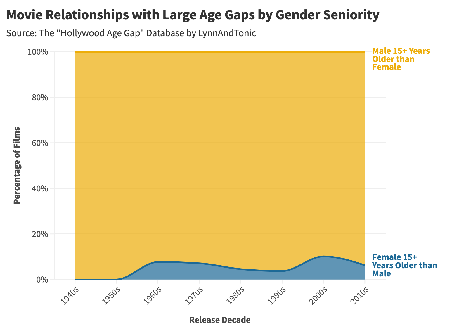
I subscribe to a newsletter called Data is Plural, which catalogs five interesting datasets every week. This listerv was started ten years ago by Jeremy Singer-Vine, who was early at BuzzFeed and now works as a data journalist for the New York Times. The newsletter is completely free and has given me some invaluable data sources for Stat Significant. One source I'm particularly fond of is a dataset that outlines the age difference between love interests in movies, demonstrating how frequently male actors are older than their female counterparts.
For data visualization, I use a tool called Flourish. Flourish is a free graphing software that was acquired by Canva a few years back. The site offers several templates to simplify the visualization process. Using Flourish has allowed me to cultivate a consistent and polished visual style, which is not one of my strong suits.
I really love their area charts, which came in handy for my article on how the careers of "notable people" have changed over time.

For writing, I use Grammarly because I'm terrified of making a typo and looking stupid.
What Are Surprising Pop Culture Insights You've Found?
Each newsletter takes a lot of time. I have to find a dataset, produce graphics, write a compelling story, and then copy-edit. Ultimately, what makes it all worthwhile is learning something new about the pop culture that I love.
Here are some of my favorite pop culture finds:
From Which Movies Popularized (or Tarnished) Baby Names?:
Movie characters can influence baby naming trends. These namesakes could be protagonists (like Trinity in The Matrix) or infamous characters (like Lolita from Lolita). In many cases, parents want their children to embody the traits of a fictional character, while in some cases, naming trends emerge from a name being said with greater frequency (even if it's a villain or controversial figure).

From The Rise and (Overstated) Fall of Radio:
Radio is alive and well. Given Spotify's dominance, I assumed radio listenership was declining rapidly, but I was wrong.

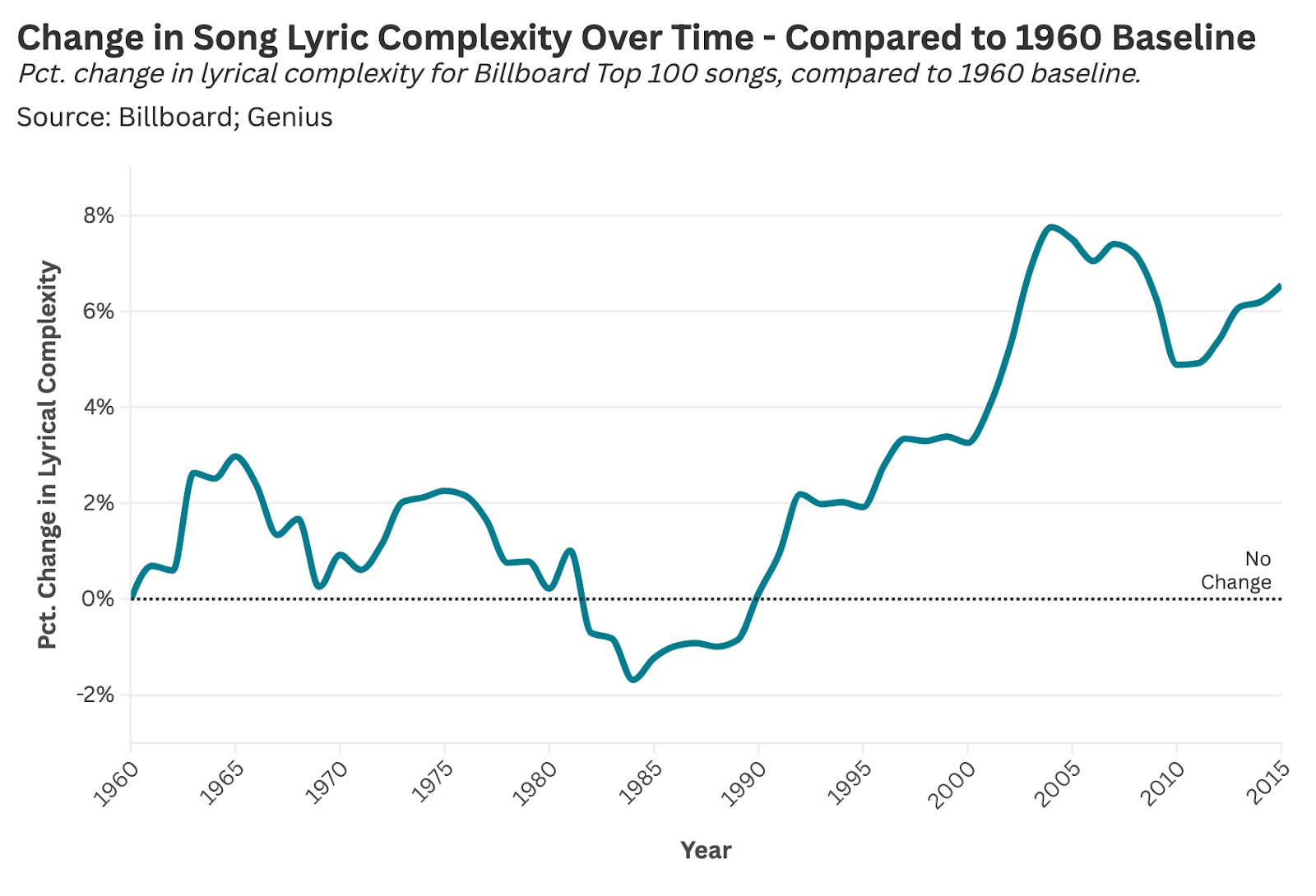
From How Have Song Lyrics Changed Since the 1960s?:
The rise of rap and hip-hop (starting in the late 1980s) has increased the lyrical complexity of Top 40 music.
From How Streaming Elevated (and Ruined) Documentaries:
Cable and, later, streaming's embrace of documentary film—particularly true crime—has led to declining project quality over the last two decades, which is unique compared to other storytelling formats and genres.

From How Has Music Changed Since the 1950s?:
Song length has gotten shorter with the rise of iTunes and streaming. People buy or stream tracks instead of buying albums, which spawned shorter run times.

Today's deep dive into data viz comes from Daniel Parris. If you want to read more from him, sign up for his newsletter, Stat Significant.
Upcoming Member Events
I have been working to add more and more value to the Seattle Data Guy Newsletter. As part of that, I’ve been running member webinars!
Here are the next three I have planned!
How To Pick The Right Data Tools For Your Team - March 27th, 9 AM MT
Breaking Into Data Consulting - From Marketing To Positioning - April 8th, 9 AM MT
Dimensional Data Modeling Fundamentals - April 17th, 9 AM MT
If you’d like to be invited, then consider supporting the newsletter below!
Join My Data Engineering And Data Science Discord
If you’re looking to talk more about data engineering, data science, breaking into your first job, and finding other like minded data specialists. Then you should join the Seattle Data Guy discord!
We are now over 8000 members!
Join My Technical Consultants Community
If you’re a data consultant or considering becoming one then you should join the Technical Freelancer Community! We have over 1500 members!
You’ll find plenty of free resources you can access to expedite your journey as a technical consultant as well as be able to talk to other consultants about questions you may have!
Articles Worth Reading
There are thousands of new articles posted daily all over the web! I have spent a lot of time sifting through some of these articles as well as TechCrunch and companies tech blog and wanted to share some of my favorites!
Beyond The Hype: Data Teams Have A Burnout Problem

Data has a burnout problem.
Ok, it’s not just data. But there does seem to be something in the air. Conversations I’ve had—and ones I’ve heard others having in the data world—are filled with people feeling burned out.
Real-Time Flight Traffic Analytics With Estuary and StarTree
When working with real-time streaming data coming from various sources that are unstructured, whether it is a sensor or IoT data from devices or social media feeds, that needs to be quickly accessible for data warehousing for end users in a tabular form, it can often be time-consuming to capture such events. Traditionally, tools like Kafka have been used to stream and consume real-time data; however, setting up a Kafka cluster and managing its dependencies, such as ZooKeeper and Debezium, can be quite challenging.
End Of Day 170
Thanks for checking out our community. We put out 4-5 Newsletters a month discussing data, tech, and start-ups.
 | A guest post by
|
Really nice interview, thank you. Your questions were good and invited detailed answers.