
Data Teams: It’s Time to Touch Grass
Hi, fellow future and current Data Leaders; Ben here 👋
I know it’s been a while since I last wrote, I’ve been completing projects and just got back from camping out in the mountains of Colorado. I wanted to share some thoughts about data the challenges data professionals face even once you’ve been able to put together a dashboard or develop a model.
Before diving in to that, I wanted to let y’all know that I’ll be running several events in person in the UK, Seattle and Denver. The first will be in the UK, so if you’d like to join me after Big Data London, you can sign up here!
Food and drinks will be provided as well as a live band!
Now let’s jump into the article!
Intro
This weekend I got to step away from my computer and disappear into the mountains of Colorado.
No cell service.
36-degree nights.
Elk bugling in the background.

In those moments, the only thing that mattered was simple, staying warm and dry.
Now it’s back to the data mines for me.
Where I find that many of our professional lives revolve around data and metrics, numbers we obsess over, charts we polish, dashboards we argue about in meetings.
Yet those numbers are almost always one step removed from reality.
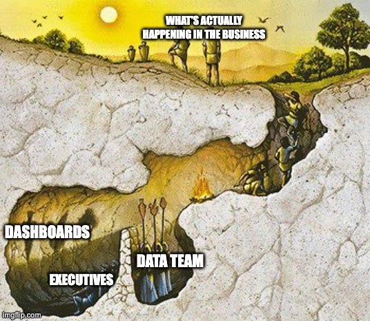
They’re shadows on the wall, so to speak. A limited reality that often fails to paint the full picture.
In business and data, we often confuse KPIs moving with progress and assume our dashboards and metrics are telling us the whole truth.
So in this piece, I want to outline some of the challenges data teams face when they take data at face value, and how to stay grounded in reality.
Data Is Often A Derivative Of Reality
One of the points I always come back to is this, the data us analysts and data engineers work with is a derivative of reality, not reality itself.
What we capture in our tables, orders placed, clicks logged, tickets closed, are slivers of what happened. We can learn a lot from that data, don’t get me wrong. They provide so much in terms of providing signals.
But they rarely contain the full context of why things happened or how they unfolded.
Some companies have gotten better at stitching together context by joining disparate datasets. But in my experience, most haven’t. They’re still operating on thin transactional exhaust so to speak, that gives a very narrow view of what’s really happening(or perhaps a better reference is the shadows from the cave.)
You can see that sales went up
You can even make a few educated guesses about why, pulling in other thin context sources
But if your only view is the data, your perspective will always be limited
One data leader I spoke with makes a point of visiting physical warehouses regularly. Not because they love forklifts( I mean, maybe they do!), but because they want to see how dashboards, models, and tools are actually being used by staff on the ground.
That’s how they discovered that several “data quality problems” weren’t random at all, they were the result of end-users inventing shortcuts to bypass a slow form. The data looked bad because the system design was bad.
The same pattern plays out at the highest levels. Jeff Bezos once asked a customer service leader how long the average wait time was. The answer came back confidently: under one minute, backed by the data. Bezos picked up the phone, dialed Amazon’s 1-800 line in front of his executives, and waited. Minutes ticked by before anyone answered.
Paul Stroup covered that below in a past post.
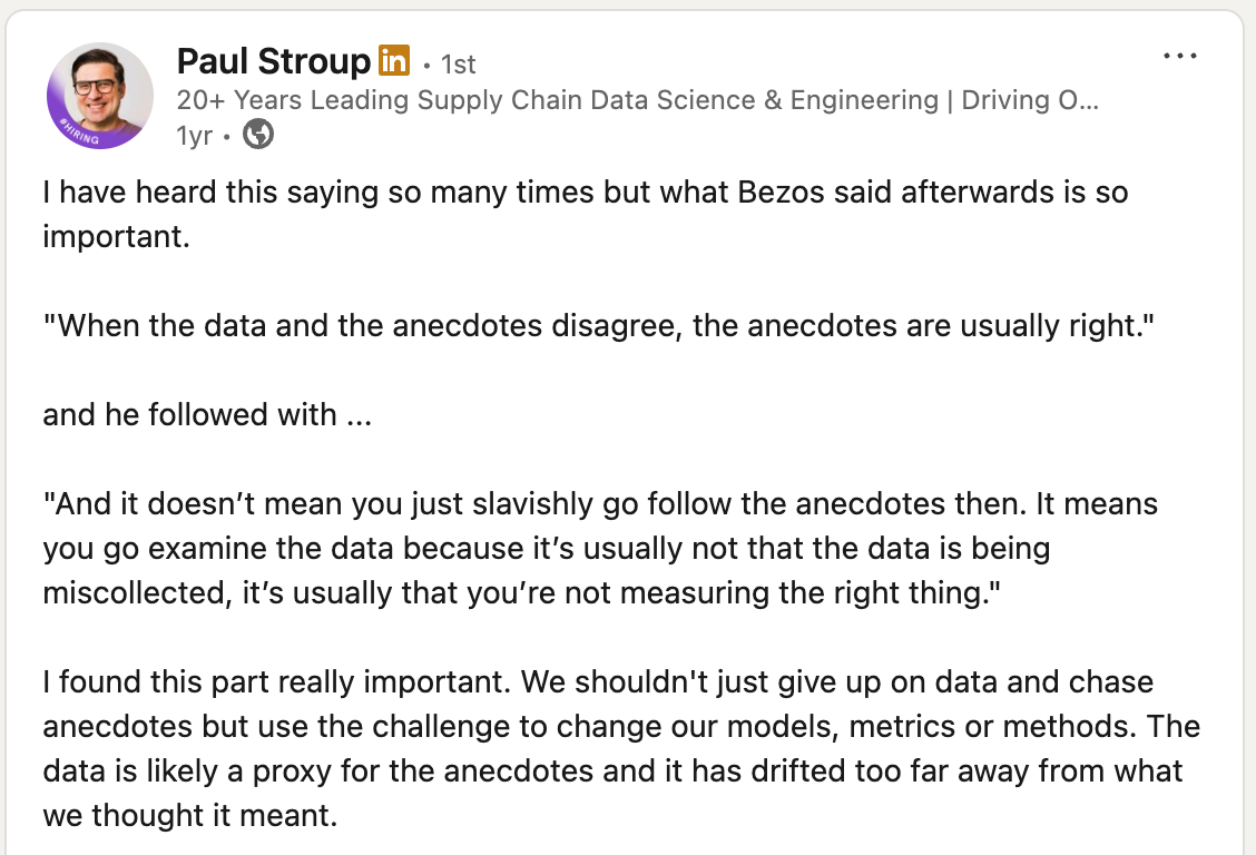
When I’ve spoken with Paul Stroup he often referenced truth-seeking over being data driven. I took this to mean that instead of blinding letting data guide you, you use it to further inform your thinking and decisions. Along with those walks on the factory floor and discussions with end-users.
Metrics Can Be Gamed
“When a measure becomes a target, it ceases to be a good measure.” - Goodhart's Law
That’s the paradox we live with in data. The moment a metric becomes the focus, it starts to lose its usefulness.
Or as one director once told me:
“Give me metrics, and I will game them.” - Justin Ward
One example of this was given to me by a test engineer who’d just retired. Their company enacted metrics for test engineers. In this case, “Number of tests written.” Sounds good, until someone writes a dozen trivial tests, checking if the input box can take “A,” “a,” “B,” and “b”, just to hit the metric.
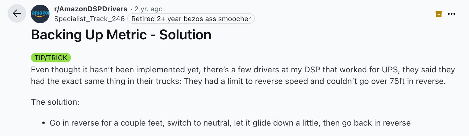
I also found this post on Amazon drivers trying to work around the limitation of how far they can back-up that was being tracked.
A more consequential example comes from the UK’s ambulance response time targets. For years, the goal was: 75% of life-threatening calls reached in under 8 minutes.
Once that became the number to hit, the system adapted and here is what researchers noticed.
Front-loading to “stop the clock - Organizations dispatched a solo Rapid Response Vehicle (RRV) so a clinician could reach the scene within 8 minutes and mark the call as “responded.” The metric now looks better, but the patient often still waited for the transporting ambulance to arrive. Net effect: the number improved while time to definitive care didn’t, and operational costs went up because two vehicles were now tied to one incident.
Misclassification inflating urgency - Upstream triage protocols tended to over-prioritize cases into the highest category to avoid risk. That swelled the pool of “8-minute” calls, spreading resources thin and creating a perpetual scramble against the clock. In some services, this was compounded by “Call to Connect” (starting the timer when the call hits the control room), which effectively shortened the window and encouraged dispatching before sufficient clinical information was gathered, raising safety risks and degrading allocation quality.
Sure, the metrics looked better in some cases but it wasn’t actually leading to better outcomes.
That’s the trap of mistaking metrics for reality. When we sit in our ivory data towers, staring at models and dashboards, it’s easy to believe we’ve solved something. But unless we’ve really dug into both the data and how the humans systems are actually responding, we might be seeing only a foggy picture.
Counter-metrics can help, but they also rarely tell the whole story. The only way to truly understand is to leave the dashboard, talk to end-users, see how the goals are followed, and watch how metrics shape behavior in practice.
Otherwise, we risk optimizing the number instead of the outcome.
Tips for Making Data Work Reflect Reality
Now I am not saying we can’t provide value, or that we should just give up. I do believe data professionals can help the business, otherwise I wouldn’t invest so much time doing this type of work.
But here are some tips if you’re trying to really put the whole picture together.
Get closer to the business - Don’t just sit behind dashboards, walk the warehouse floor, sit in on sales calls, shadow customer support. Seeing how data is actually created (and how tools are really used) will uncover blind spots you’ll never find in SQL. It actually reminds me of when I worked at the last restaurant, we’d have farm days where before our shift we’d spend and hour or two in summer working on the farm attached to the restaurant. Mostly picking the ingredients we’d end up using. It just gives you more respect for the full process.
Collect data that adds context - You can only gain a lot of insights from your core systems. But there are always limitations. Where possible, expand what data you capture or try to pull more in. In the future, I believe more and more organizations will use data sets that are unstructured to provide even more context, better service, etc.
Validate dashboards with lived experience - Build processes where leaders and analysts test the system, call the support line, go through checkout flows, order a product. Treat KPI improvements as an opportunity to dig into the change further. So you improved NPS or churn, great, was that just for certain segments or users? What actually happened?
Combine quantitative and qualitative - Numbers need stories. Include user feedback, frontline anecdotes, and case studies in reviews alongside dashboards. One, it’s great for communicating with management and it’s what you often see TV reporting do. Capturing a statistic in a single story. Two, it helps you better understand what is actually happening.
Retire or revise stale targets - Metrics that once correlated with outcomes can drift. Review them at a normal cadence. Certain metrics will need to be replaced or retired. They might be getting ignored anyways, so it’d be better not to have them distract from what your company is currently doing.
Final Thoughts
We can learn a lot from the data we have in our core systems, but it doesn’t mean we always have the whole picture.
Metrics don’t live in a vacuum. People respond to them, policies reshape behavior, and real-world events add layers we can’t fully anticipate. A dashboard might tell one story today, and a very different one six months from now.
That’s why good data work isn’t just about finding the right number, it’s about staying close to the reality behind it. Talking to the people who live with those policies, seeing how the systems play out on the ground, and being willing to adjust when the numbers stop reflecting the outcomes we care about.
As always, thanks for reading.
Upcoming Data Events
Articles Worth Reading
There are thousands of new articles posted daily all over the web! I have spent a lot of time sifting through some of these articles as well as TechCrunch and companies tech blog and wanted to share some of my favorites!
Building Uber’s Data Lake: Batch Data Replication Using HiveSync
Uber’s massive 350 PB dual-region data lake, among the largest globally, is meticulously designed for high availability through an active/standby configuration. At Uber, HiveSync plays a critical role in this architecture by ensuring cross-region data consistency, a cornerstone of Uber’s disaster recovery strategy. It diligently manages data replication and synchronization, providing robust protection against potential hardware failures and regional disruptions. This blog post delves into the technical intricacies of HiveSync and its pivotal contribution to safeguarding Uber’s multi-region data ecosystem.
The Inconvenient Truths of Self-Service Analytics
Self-service analytics is a hoax. A myth. The so-called holy grail.
If you’ve worked in data long enough, you’ve heard that line.
Maybe you’ve even thought it yourself, like the time your CEO asked for a “quick data pull” despite you building them a perfectly good dashboard that already answered the question.
When I first entered the data world, self-service analytics was everywhere. Tableau was pushing it hard, then Salesforce bought them for $15.7 billion, and every vendor promised it would free analysts from endless requests.
A decade later, we’re still chasing that dragon.
Now the narrative has shifted: dashboards are “dead,” or the problem was that Tableau and Looker just “never did it right.”
Say that self-service is a failure in the wrong room, and someone will tell you, “You were just doing it wrong.”
Wherever you stand on the debate, I want to explore where self-service has struggled, and what might actually work next.
End Of Day 193
Thanks for checking out our community. We put out 4-5 Newsletters a month discussing data, tech, and start-ups.
If you enjoyed it, consider liking, sharing and helping this newsletter grow!
Very well written, thanks Ben.
Amazing article!!