Are dashboards dying?
Recently I read Taylor Brownlow’s article on Towards Data Science where they proclaimed that dashboards are dead.
Instead, they suggested that much of analytics would switch over to more notebook-style presentations.
Although there were a lot of good points in the article in terms of why many companies struggle with dashboards. It was a far cry from needing to throw the baby out with the bathwater.
Also, Taylor is the Head of Data at a company focused on notebooking vs. dashboards. So perhaps there is a little bias in the article…just a little.
The truth is, dashboards can and are valuable tools when done well.
Dashboards can help us synthesize and summarize millions, if not billions of rows into concise and digestible bits of information.
And this is not limited to internal users.
It is becoming more and more common for low-code solutions to provide the ability to share your dashboards externally.
May it be to provide our clients extra value, or maybe your entire product is a dashboard that you sell to other external users.
Some tools range from Tableau to Yellowfin, from custom code to drag and drop solutions. All with different price tags and features that could make or break your companies final decisions.
In this newsletter, we will outline some of these products.
5 Dashboard Tools - From Tableau To Yellowfin
Tableau
Tableau is an analyst-first tool.
It is easy to use in terms of developing reporting. This is something I hear over and over again from analysts.
Recently I was working with a client who was trying a few different tools and they found some tools like Trevor.io clunky and Looker difficult to manage.
However, as soon as they tried Tableau, they were instantly converted. Tableau’s drag and drop focus can make it a great solution for analysts who don’t have as much SQL experience.
Tableau also plays a role when it comes to data exploration. Its drag and drop nature makes it easy to quickly create scatter plots and other charts that can be used by analysts to understand complex data sets.
In addition, Tableau also provides developers the ability to embed their reporting for external customers.
Pros
Analyst centric user interface
Offers “Viewer” user types that can help reduce costs
A lot of supporting documentation
Large user base
Cons
Lack data modeling and data dictionary capabilities
No real version control
Tableau can get expensive depending on how many Creator licenses you need. One creator license costs about $1,000 per user(but one viewer license only cost about $150)
Looker
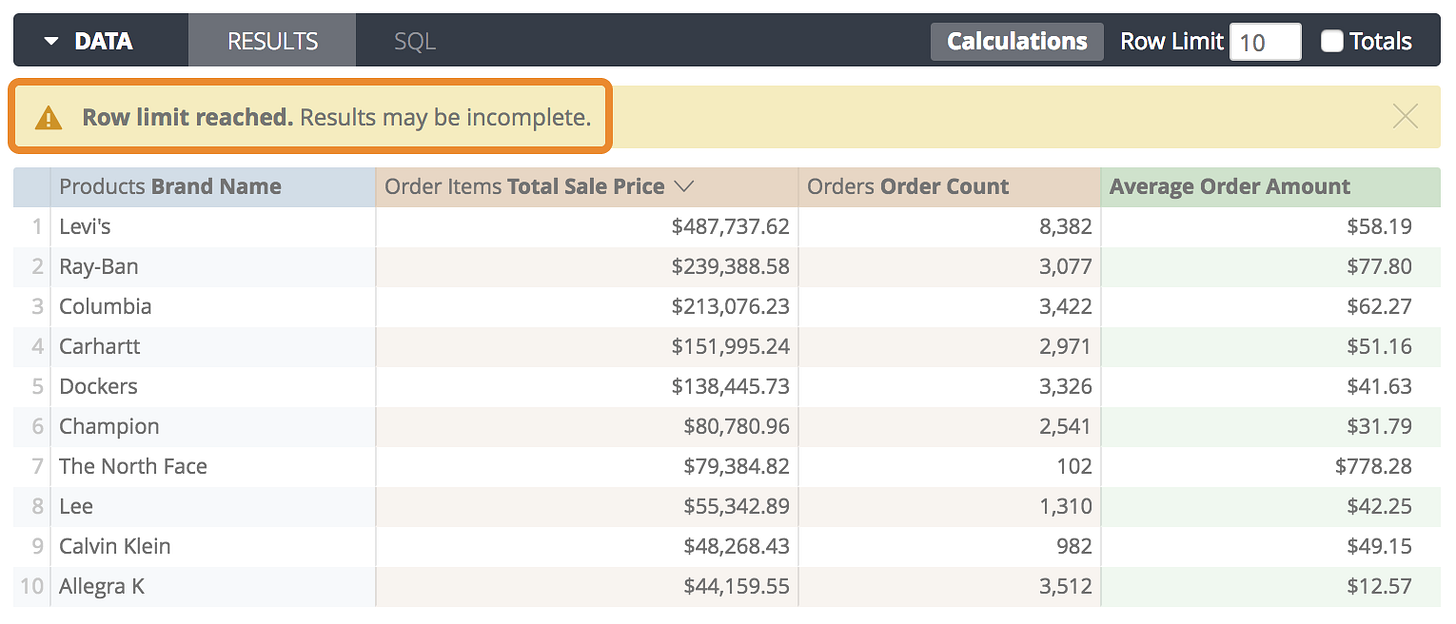
Figure 2. Looker Report Example
Looker is often described as the developers data visualization tool. Many users find it a little more difficult to use compared to Tableau.
However, Looker is 100% cloud based and doesn’t require you to download an application(Like Tableau). In turn making it easier for developers to share their work and collaborate.
This also leads to improved performance because of the cloud native architecture.
Looker’s architecture takes advantage of modern cloud databases’ native scalability and performance. Unlike most competitors, Looker doesn’t rely on stale data extracts or a proprietary in-memory architecture that force you to predict the questions your users will ask. - Looker
Overall, Looker has become popular as a cloud first data visualization tool.
Pros
Developers may prefer in terms of integration
100% Cloud based and easy to collaborate on
Data modeling layer that can help predefine and manage complex data models
Cons
More developer-centric
Can be very expensive (Looker’s License is around $50,000 and then $30 per user per month)
Mode
Mode is a BI application that not only has tools for you to perform data analyses and build dashboards, it also offers tools for you to perform more complicated data analytics using machine learning with Python/R in one single cloud-based application. And Mode promises to give their users an experience of “for analysts by analyst”.
Pricing, like many solutions, is highly dependent on your needs. Mode offers both a business and Enterprise pricing tier which forces interested parties to request more information.
However, with our research, we would say it slightly cheaper than Looker for the yearly licenses but about the same cost per user after.
Pros
Version Control is automatically integrated into Mode’s process (unlike some of the other solutions on this list)
Cloud-First Architecture - Meaning its easy to collaborate and share your charts
A good mix of dev and analyst friendly features
Cons
Mode is still fighting for market share which means there are often more analysts familiar with Looker and Tableau
Mode is not as friendly as Tableau and is not as well documented
Holistic.io
Established in 2015, Holistic provides an end-to-end data analytics and business intelligence platform. Like most tools developed after the early 2000s, Holistic is cloud-based. meaning it is easy to collaborate and share reporting.
Holistic also boasts that you can ingest, transform and visualize data within a single tool.
Truth be told, I have rarely found it a good idea for a tool to try to take care of the entire data workflow. Although Holistic focus is to improve the DataOps process. I do often find it concerning when a tool doesn’t specialize as it often leads to problems either with the flexibility of usage or usefulness of features.
But Holistic is still relatively room so there is a lot of time for it to grow and find its best fit.
Pros
Analyst friendly development environment (drag and drop)
Notification systems developed for Email and Slack so you can set scheduled reporting, alerts, and shareable links.
Centralized data management that prevents data knowledge from being locked to a few individuals
Cons
Holistic.io is still a newer product and in turn, has a lot of room for improving the features the product offers
Holistic.io is a start-up which means it could be bought out by a larger company to reduce competition
Limited documentation
YellowFin
Figure 3. YellowFin Report Example
YellowfinBI is a lesser-known BI option when it comes to embedding reports. However, it can provide an alternative to some of the popular solutions. It doesn’t have an intuitive UI compared to Tableau and in turn, does have a little bit of a learning curve.
Some benefits it offers include the ability to enforce versioning of reports and dashboards so you can always roll back to the previous version.
Pros
Allows you to white label dashboards and their reporting server
A good mix of developer and and analyst friendly
Cons
A flat fee of 50,000 USD for a yearly licenses for 4 cores (Fine if you’re a large company but not if you’re a small company)
Yellowfin is not as friendly as Tableau
Dashboards Aren’t Dead
Dashboards are far from dead.
They still provide a lot of value when they are developed correctly. A well-developed dashboard helps condense complex information in a world that is blowing up with data.
Using dashboards to find the signal in the noise helps business executives and owners make more confident decisions.
In addition, dashboards can be developed to easily share both internally and externally with clients and vendors who may also benefit from the knowledge.
So for now, dashboards are here to stay.
Ask A Data Consultant - Office Hours
Every newsletter I open up a day or two with a few slots for open office hours where my readers can sign up and you can ask me questions. I got to answer a lot of great questions so far and hopefully, they helped provide a lot of insights for those who signed up.
Sign Up Below:
Next Open Office Hours
Sign Up For My Next Office Hours on May the 28th at 10 AM - 3 PM PT or between 5 PM - 7 PM PT
Career Corner - 5 Data Engineering Project Ideas
Merely graduating with a background in Computer Science or Information Systems is rarely enough to get a data engineering position.
You'll need related real-world experience to fine-tune your hard skills. Concerning your future job search, one of the best ways to develop and convey these skills is through a data engineering portfolio projects.
In this video, we will review five potential project ideas with data sources.
For 2 Cups Of Coffee, You Could Help Support This Newsletter
If you’re interested in supporting this newsletter, then consider subscribing for a month!
Articles Worth Reading
There are 20,000 new articles posted on Medium daily and that’s just Medium! I have spent a lot of time sifting through some of these articles as well as TechCrunch and companies tech blog and wanted to share some of my favorites!
Achieving Insights and Savings with Cost Data
Business profitability and sustainability are powerful reasons to invest in infrastructure efficiency, but it is easy to feel lost about how to actually reduce costs. A foundation of robust and actionable data is essential for a successful efficiency program. At Airbnb, building this foundation made it possible to prioritize savings opportunities and ushered in a wave of cost reductions.
More importantly, cost data has become a lever for long-term control. The team can react quickly before a spike wreaks havoc on the monthly bill and plan ahead when a big new project could become expensive. At the company scale, visibility into cost and usage has sparked a cultural shift. When savings can be measured, they can be recognized, and cost efficiency projects become exciting opportunities. As of early 2021, the most viewed dashboard at Airbnb is a dashboard of AWS costs.
How Pinterest Fights Spam Using Machine Learning
Hundreds of millions of people regularly visit Pinterest to visually discover inspiring ideas among billions of Pins. Inspiration is a high bar and we must be vigilant in ensuring that Pinners don’t see spam, harmful content or misinformation. To enforce our community policies and maintain an inspiring environment, we use the latest in machine learning technology to build automated systems that swiftly detect and act against both spammy content and spammers.
Streamlining Data Monitoring With WhyLogs And MLflow
Everyone who has worked with machine learning models in production is familiar with their complexity of deployment and lifecycle management. The task becomes particularly grueling given the current fragmented tooling ecosystem.
There is a smörgåsbord of tools supporting each individual stage of this cycle, which forces data science teams to build custom pipelines for the various ML frameworks (or even individual algorithms) that they use. Something as inconsequential as training and deploying a simple Scikit Learn linear regression model to SageMaker can take weeks or months to productionize, if your team doesn’t have a pipeline already built for these specific frameworks.
End Of Day Eight
Dashboards aren’t dead and using dashboards to display your data engineering project might be a good plan.
Whether you are looking into the classic Tableau or into the modern data stack options like Mode, these tools can make displaying data easy.
Whether you know code or not.
So what is your thought, notebooks or dashboards?


